
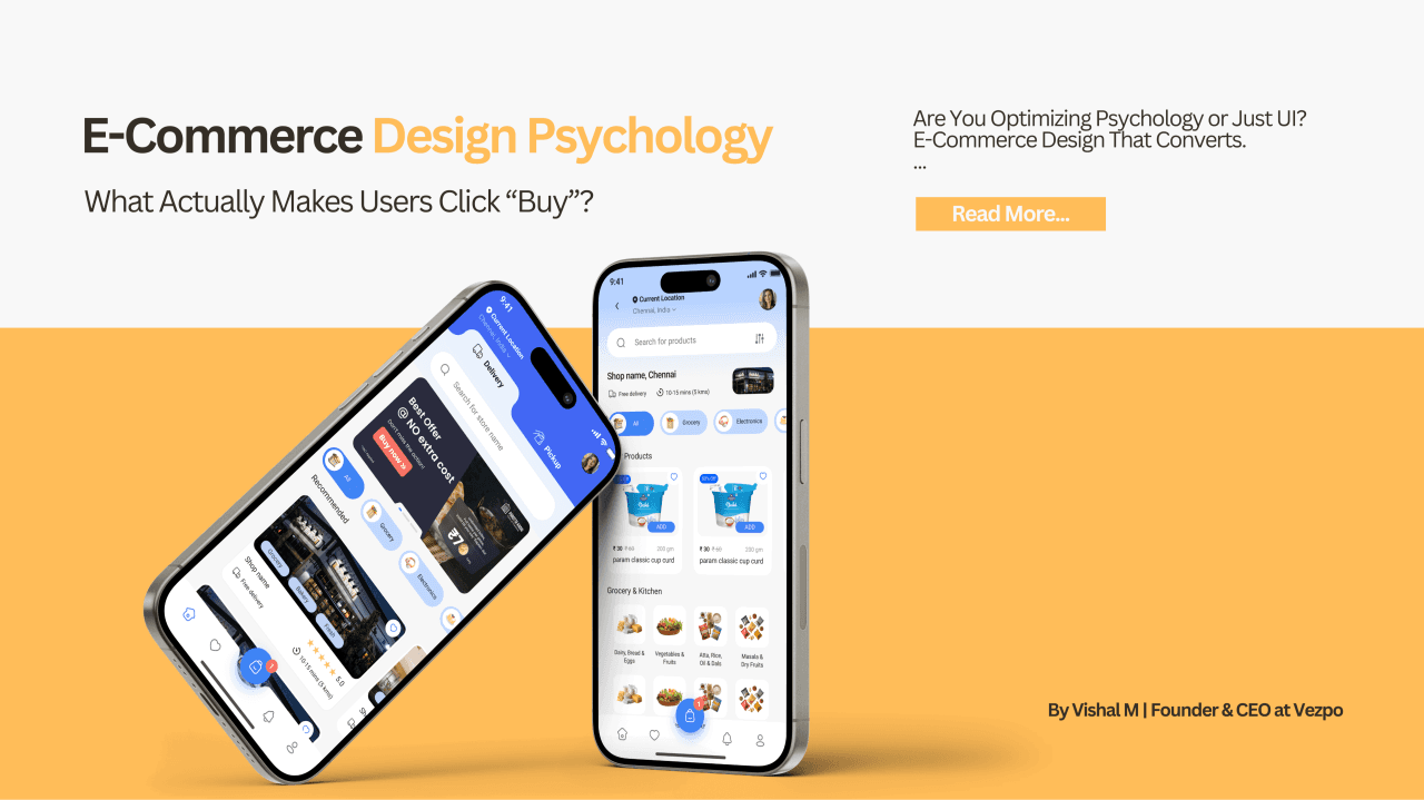

Ever wondered why two products with similar price and quality can perform completely differently online?
It’s not just marketing — it’s design psychology. Design isn’t decoration. It’s persuasion without words.
Let’s dive into how psychology meets design, and why messy UX kills sales while thoughtful experiences make people actually want to buy.
1. First 5 Seconds: The Trust Test
In the first few seconds of landing on a page, the human brain runs a rapid subconscious algorithm:
- Is this real?
- Is it safe?
- Can I trust it?
- Do I belong here?
This is why first impressions in e-commerce are everything. A messy, cluttered homepage tells a user - without words, that your business is sloppy or untrustworthy. On the flip side:
- Clean, structured layouts
- Professional typography
- Clarity in messaging
- Genuine images
all signal credibility and reliability.
At a glance, trust is visual - and that visual trust influences whether someone feels comfortable enough to scroll or bounce instantly.
According to research, companies with poor or confusing design see much higher bounce rates and exit rates, while intentionally designed UX increases user engagement and repeat purchases.
2. Cognitive Load: Remove Mental Friction
Every extra step, confusing image, or ambiguous button makes users think harder.
And here’s the truth: People don’t like thinking when they’re shopping.
People want:
✔ Quick rewards ✔ Clear pathways ✔ Effortless decisions
Every bit of complexity - from unclear categories to cluttered pages - increases mental strain (a.k.a. cognitive load). When visitors have to figure out what to do next, many simply leave.
Great design reduces cognitive load.
It gently guides choices, highlights the next action, and reduces hesitation — making the path to “Buy Now” obvious and friction-free.
3. The Power of Visual Hierarchy
Humans scan before they read.
That makes visual hierarchy one of the most potent persuasion tools in e-commerce design.
A strong visual hierarchy:
- Directs eyes to what matters (product, price, CTA)
- Uses contrast to highlight actions
- Balances whitespace and structure
If every element looks “important,” nothing feels important.
A well-designed page answers user questions in order:
- What is this?
- Why should I care?
- Why should I trust this?
- What do I do next?
Good hierarchy answers all four instinctively.
4. Real-Time Insight: Buyer Behavior Revealed (Survey & Stats)
Here’s where design psychology meets actual data — fresh insights that tell how real users behave online:
🔎 Key E-Commerce Design Statistics
- 73% of consumers say experience is an important factor in purchasing decisions.
- About 69.57% of online shoppers abandon carts because checkout is too complicated.
- 93% of consumers focus more on visual appearance than other factors when shopping online.
- 88% of online consumers are less likely to return after a bad experience.
- A one-second delay in page load can decrease conversions by 7%.
💡 What This Means
These aren’t dry numbers - they’re behavioral truths:
✔ Visual clarity impacts perception instantly ✔ Checkout ease drives conversions more than discounts ✔ Mobile UX matters (mobile traffic often exceeds half of total visits)
And the long-term effect of a bad first experience? You’re losing repeat buyers forever - not just this sale.
5. Social Proof: Buy with Confidence
Humans are social animals. When someone else approves a product, we feel safer buying it.
This is where social proof shines:
- Reviews
- Ratings
- Testimonials
- User photos
- “Verified Buyer” badges
When people see others enjoying a product, they think:
👉 “If they bought it and liked it… maybe I should too.”
Social proof doesn’t just reassure - it shortens hesitation and speeds up decisions.
6. Micro-Interactions That Build Trust
Micro-interactions are tiny design moments - subtle but impactful:
✔ Animation when adding to cart ✔ Button feedback ✔ Progress indicators ✔ Clear confirmation messages
They tell users:
“Your action worked.”
This assurance reduces anxiety and prevents users from second-guessing their actions - which is huge for keeping them in the funnel.
7. Checkout Simplicity = Conversion Growth
Here’s where most e-commerce experiences lose half their customers.
Checkout abandonment is one of the biggest revenue killers because:
- Users are asked to create accounts
- Forms have too many fields
- Hidden costs pop up at the last moment
- Shipping or tax surprises hit late
Simple rules that work:
✔ Offer guest checkout ✔ Ask fewer questions ✔ Display all costs before checkout ✔ Make navigation back easy
Less friction = more completed purchases.
8. Emotion + Logic = Conversion Magic
People justify purchases with logic … but they decide emotionally.
If your design evokes: Confidence. Clarity. Desire.
… then logic will catch up to justify the purchase.
Design is not just how something looks - it’s how it makes someone feel.
🚀 Final Thought
E-commerce design isn’t about pretty screens.
It’s about human psychology, cognitive ease, and emotional signals that make users feel safe, understood, and motivated to act.
Design touches every moment of the journey and when done right - turns browsing into buying.
— Vishal M
Founder & CEO at Vepzo Design Studio | UI/UX Strategist
Continue the Conversation
This article was originally published on LinkedIn.
What are your thoughts on this topic?
I'd love to hear your perspective.